
Vimergy
The story:
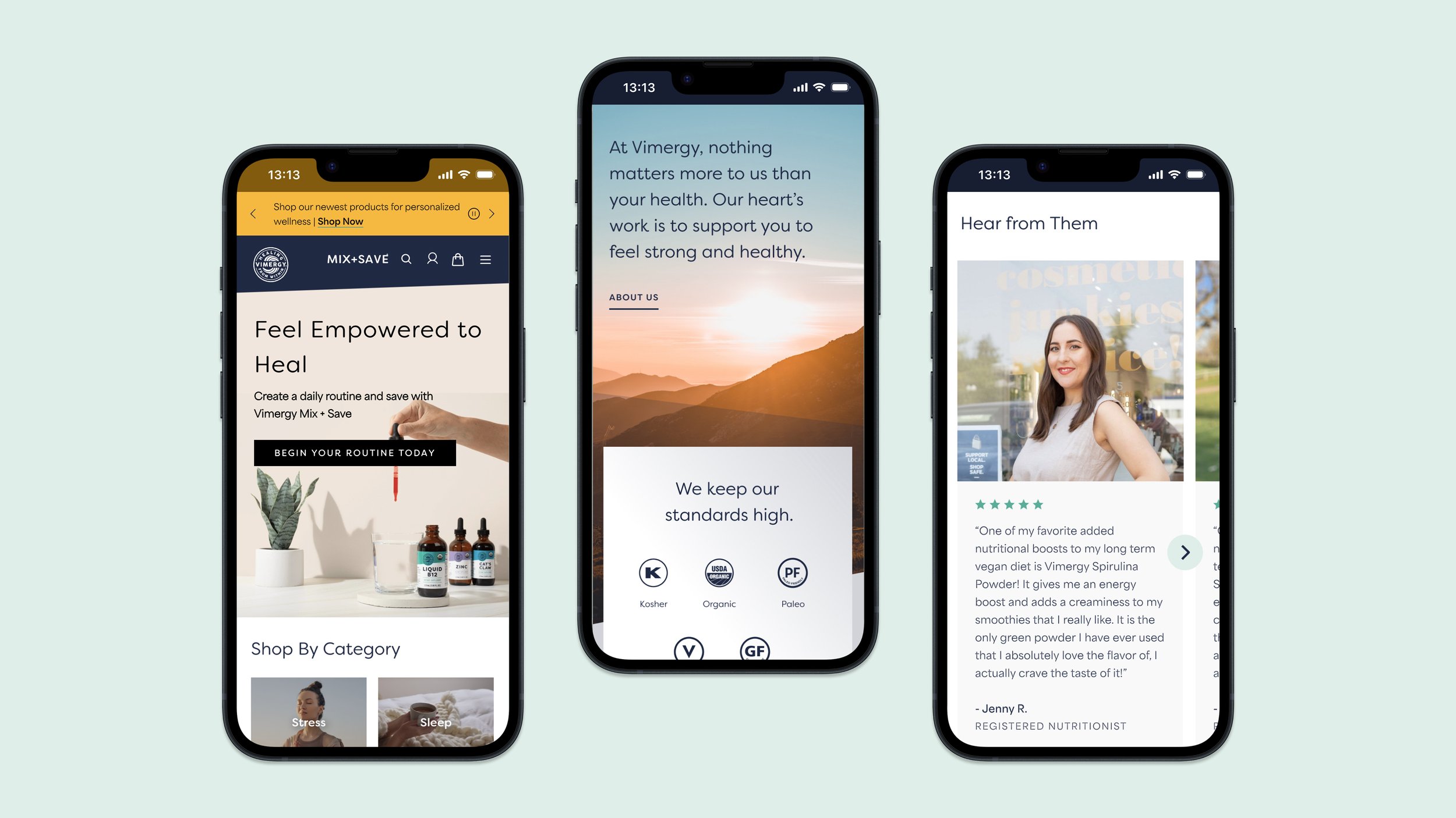
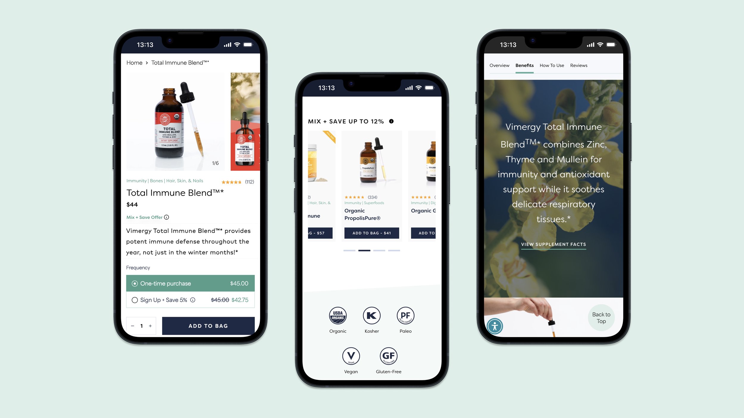
Vimergy was looking for a website redesign to enhance the customer experience, push the brand forward, and overall drive more revenue for the company. Interactive elements were inconsistent, text sections were long. Their customers were looking for more information to back up the cost of the product, like certifications, social proof and product guarantees. They were also finding it hard to compare product benefits between products within a category.
The design decisions:
Our redesign of Vimergy’s website began with a full usability audit which aligned with Baymard best practices and NNG usability heuristics. We then established the look and feel of the website with a stylescape. The content was more clearly focused on product benefits, with clear interactive elements and visual sections that provide contrast and draw the user’s attention down the page. Stock imagery was used sparsely to show products in use or closeups of product ingredients, and was carefully curated by our design team. The cart drawer made it easier for users to compare products, understand the promotions, and the PLP featured product filters that were relevant to user’s health concerns.
The results:
This redesign resulted in a 83.2% increase in AOV on the PDP and a revenue increase of 6.3%. Additionally, we continuously implemented A/B tests as part of an ongoing optimization program, generating over $500,000 in revenue within a six-month period.